
Homiu: Brand System
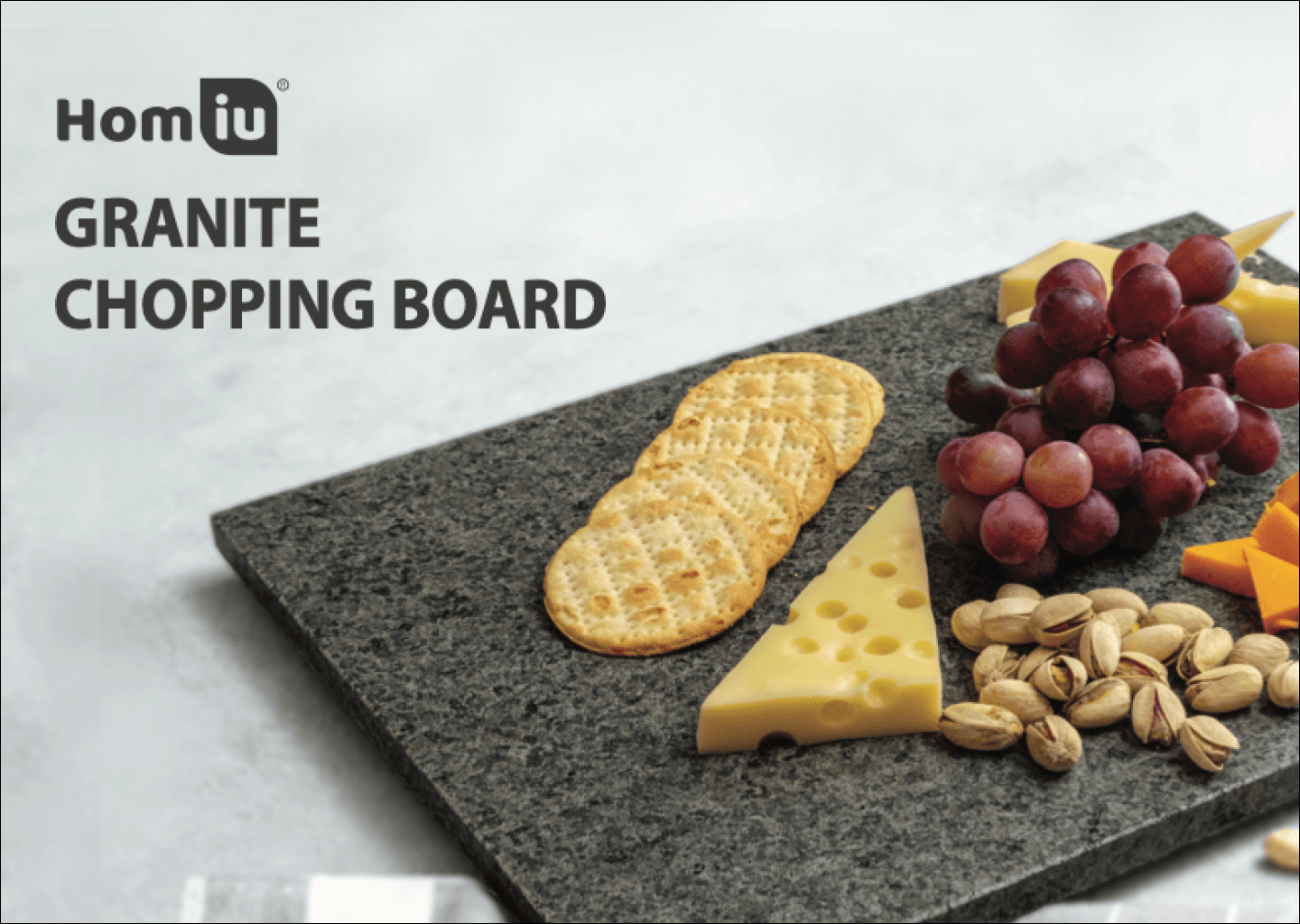
Brand image, packaging, catalogue, ecommerce photography, and product listing design for a D2C product business with multiple product lines, including marble and granite kitchen tools, glassware, and homeware products.
When I first started working with DealBerry and their lifestyle line Homiu, the company did not really have a brand system.
The products were sourced from white-label factories in China, and the packaging was treated as an afterthought. A logo would be placed on a box, the factory would print it, and the product would be shipped to customers. Each box looked and felt different. Some print quality was below standard — blurry, pixelated, and not aligned with the level of quality the products were supposed to communicate.
My role was to build the brand image from the ground up.
That meant working across the full customer-facing surface of the business: packaging, catalogue design, ecommerce product photography, product listings, marketing assets, and visual direction across multiple product lines. DealBerry sold different types of products, including marble and granite kitchen tools, glassware, and homeware categories, so the visual language had to be flexible enough to scale while still making the brand feel polished and consistent.
The challenge was not just visual design. It was translating brand positioning into something that could survive production.
I had to make practical design decisions, prepare production-ready assets, communicate with factory representatives, review packaging output, give feedback on print quality, direct or review product photography, and retouch images so the final result met the standard we wanted. A lot of the work was scrappy. There was not always a clean process, so I had to be resourceful and make decisions with the materials, suppliers, timelines, and constraints available.
Over time, the work became less about designing one box, one image, or one listing at a time. It became about creating a visual standard that could hold the brand together across different media and product categories.
The biggest lesson I took from this project is that brand design is not only about identity. It is also about execution. A brand becomes real through production details: the sharpness of a print, the quality of a photo, the hierarchy of a listing, the styling of a catalogue, and the consistency customers see across every touchpoint.
For DealBerry, my work was to make those details add up to something more coherent, more trustworthy, and more sophisticated.
Project Outcome
Built and maintained a polished, consistent visual language across packaging, product photography, ecommerce listings, catalogues, and campaign materials. The work helped DealBerry move from inconsistent white-label factory packaging toward a more sophisticated and commercially credible brand presence.